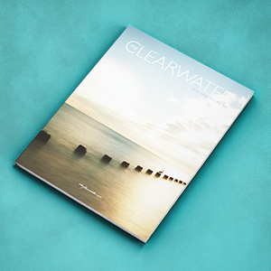
Overview:The city of Clearwater sent out a quarterly magazine showcasing the different activities and events taking place.
Dilemma: Fewer and fewer people were picking up copies of the magazine. The magazine was cluttered, and it was difficult to read. The cover photos were of lower quality photographs, yet the city did not have the budget to hire photographers.
Solution: Recreated the logotype of the magazine to give it a more current look. Organized the pages to help give more negative space, added margins so that viewers fingers would not be over words. Reached out to local photographers to see if they would be willing to donate their images of Clearwater for recognition inside the magazine.
Result: The cover of the magazine had a more contemporary look, resulting in more people picking it up, which raised attendance at the activities and events showcased inside the magazine.